Branding at the Speed of Culture
The School of Visual Art’s Masters in Branding program was the first of its kind. Now in its 10th year it was time to give the masters of branding a rebrand. So we took on this highly meta endeavor.
Capabilities
Brand Strategy
Brand Identity
Launch Campaign
Social Media Content
Featured
It’s Nice That
Recognition
D&AD Graphite Pencil
D&AD Wood Pencil
Type Directors Club Win
ADC Merit Win
One Show Shortlist
Collapse
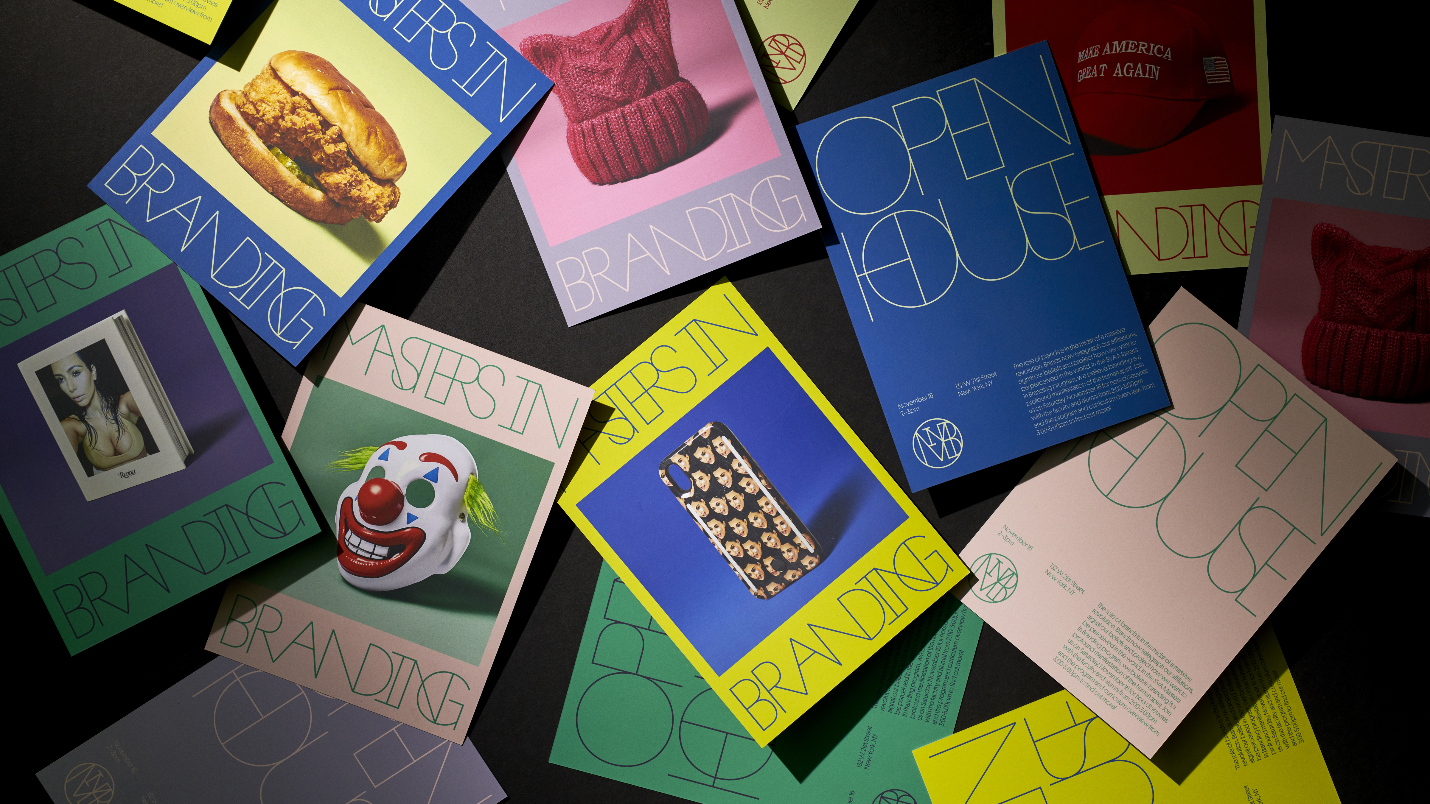
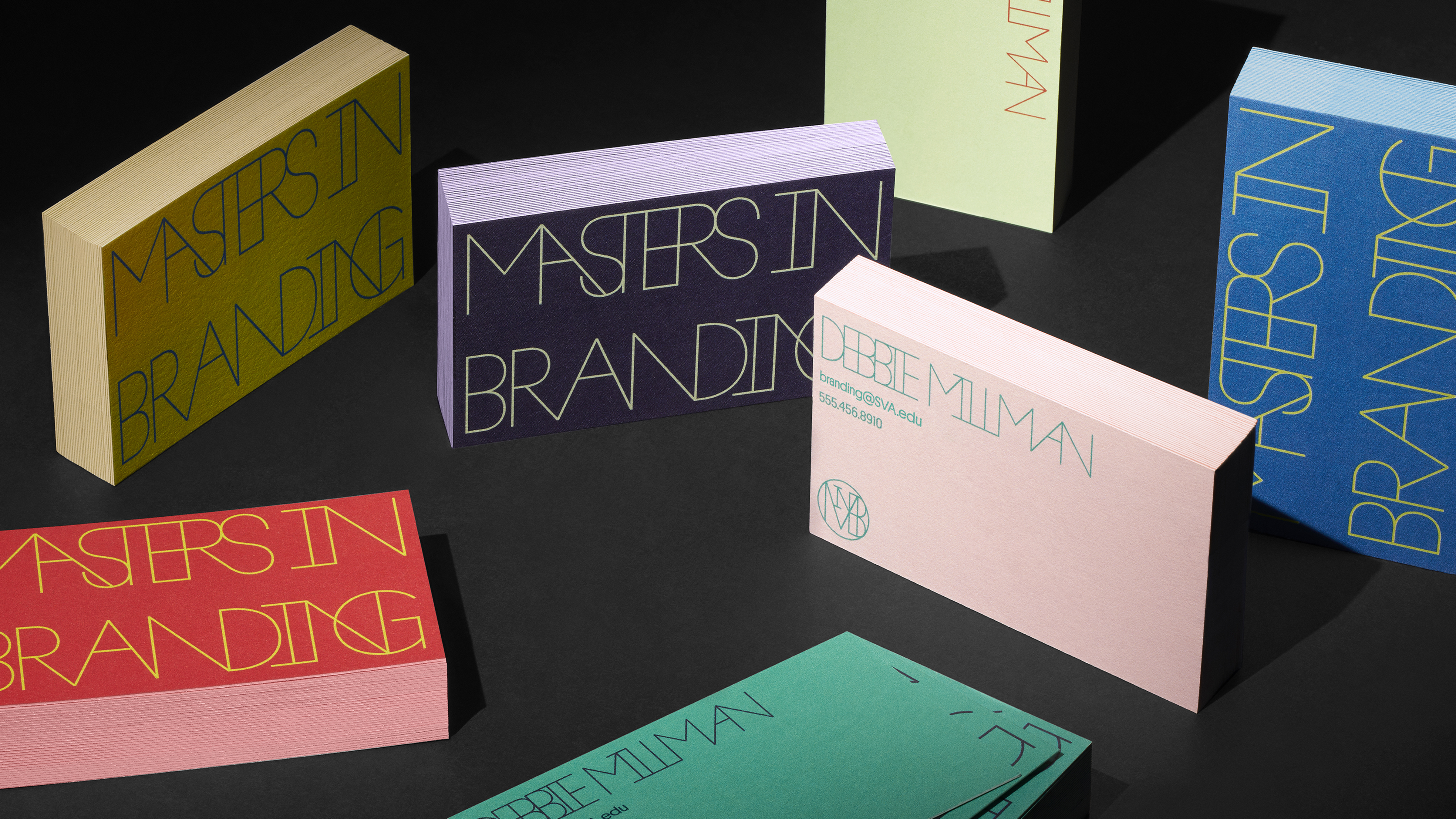
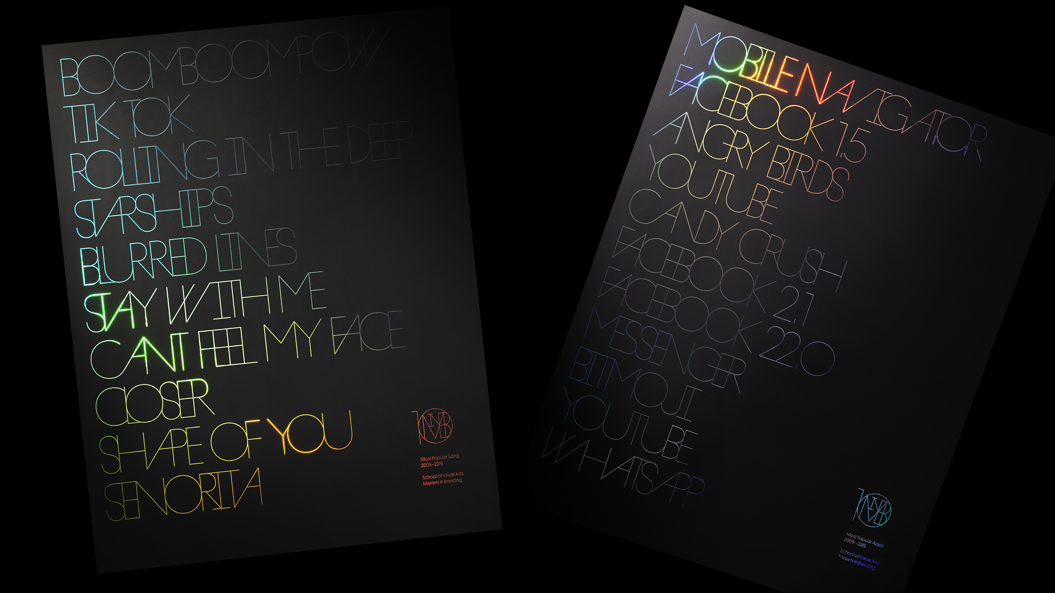
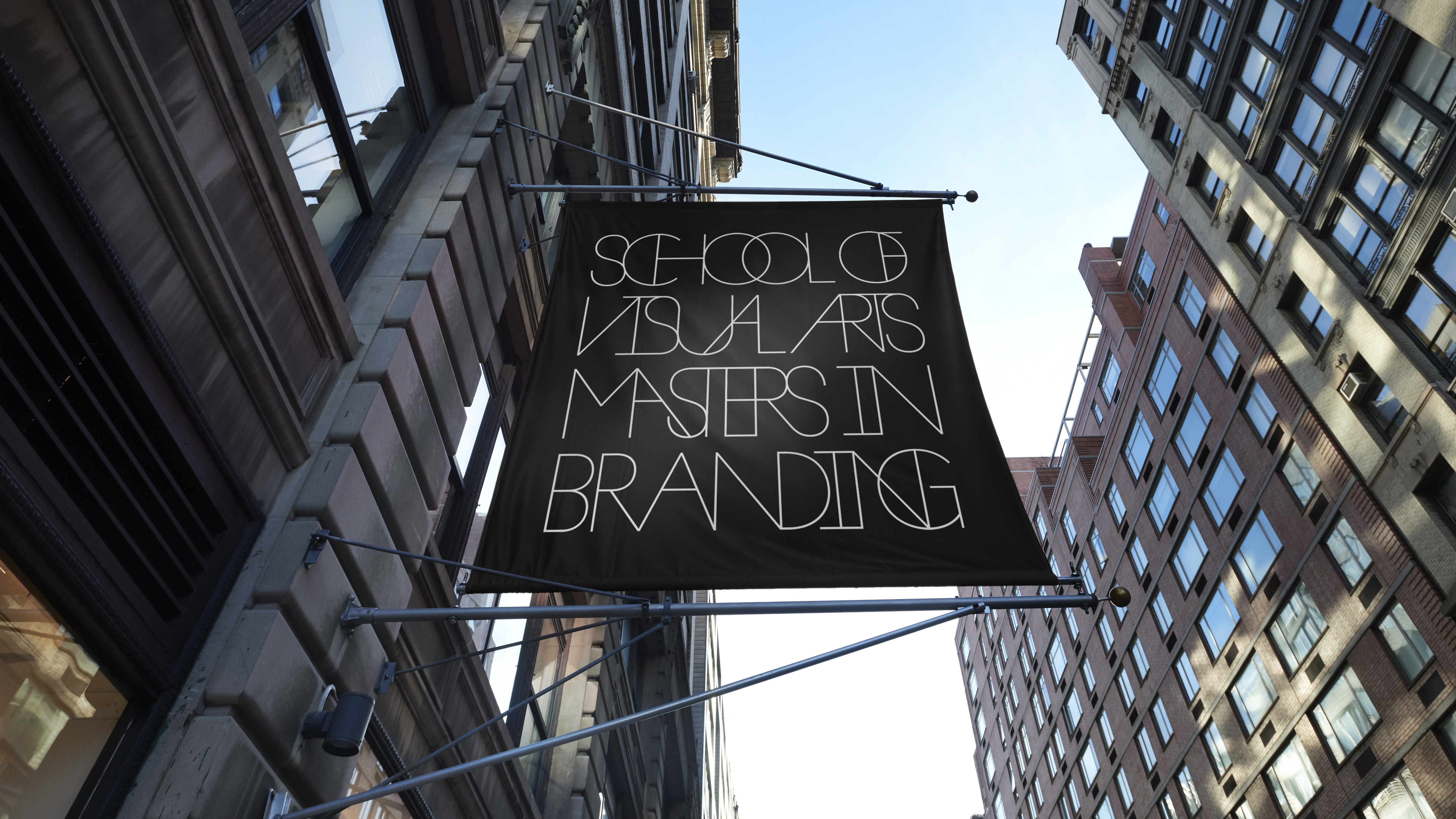
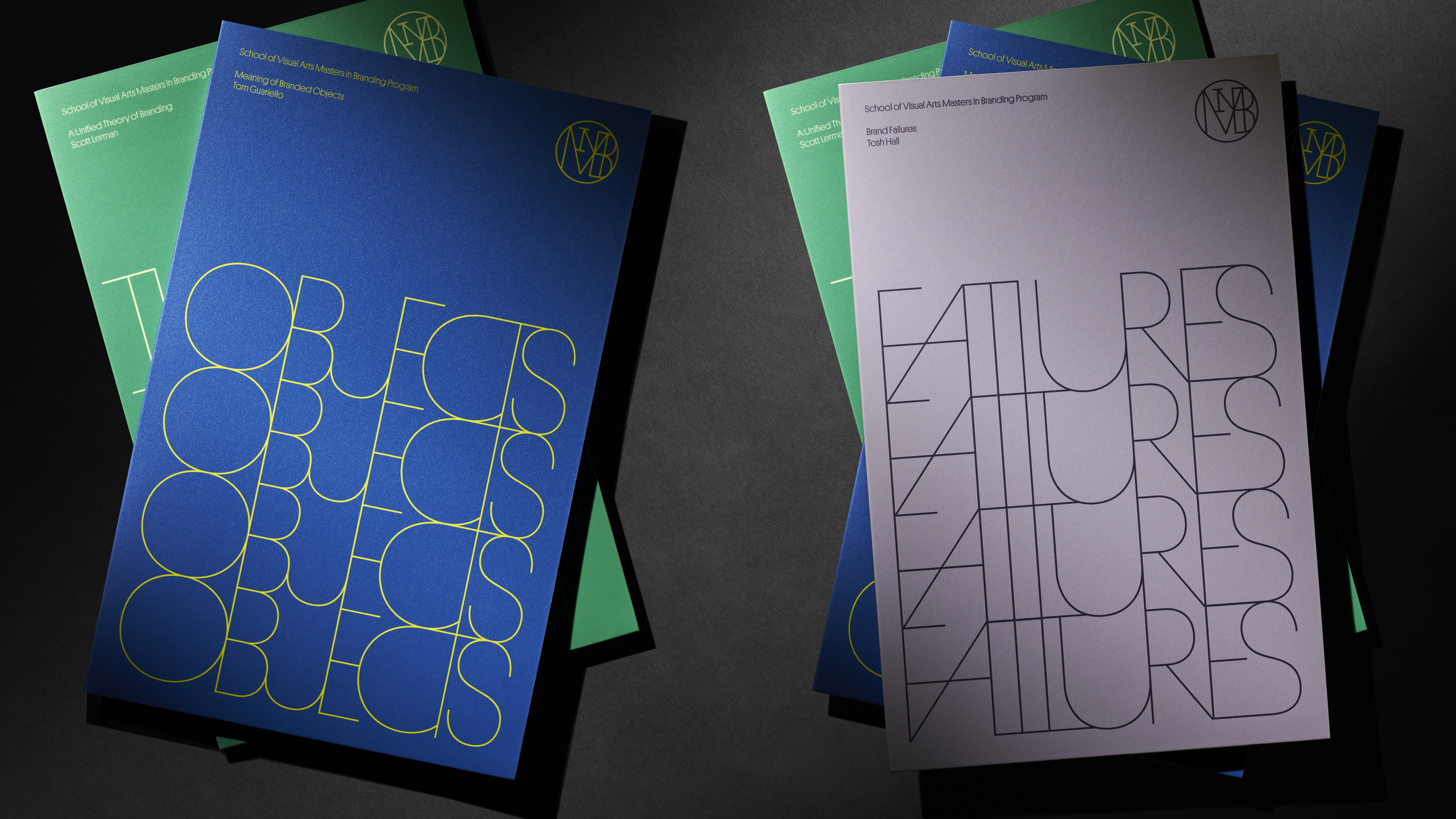
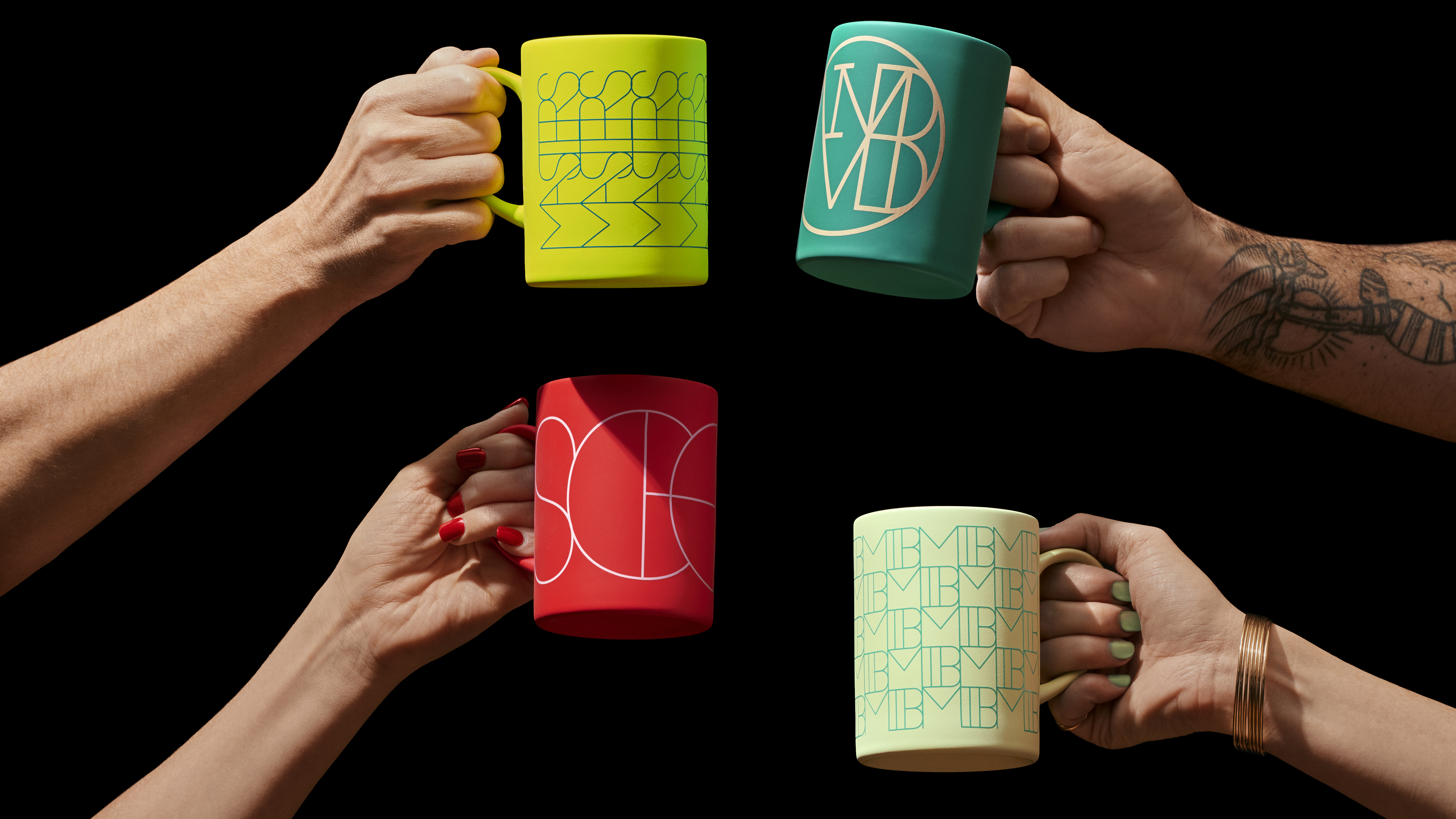
Culture reflects branding and branding reflects culture. So we had to create an identity that represents this symbiotic, constantly-evolving relationship.
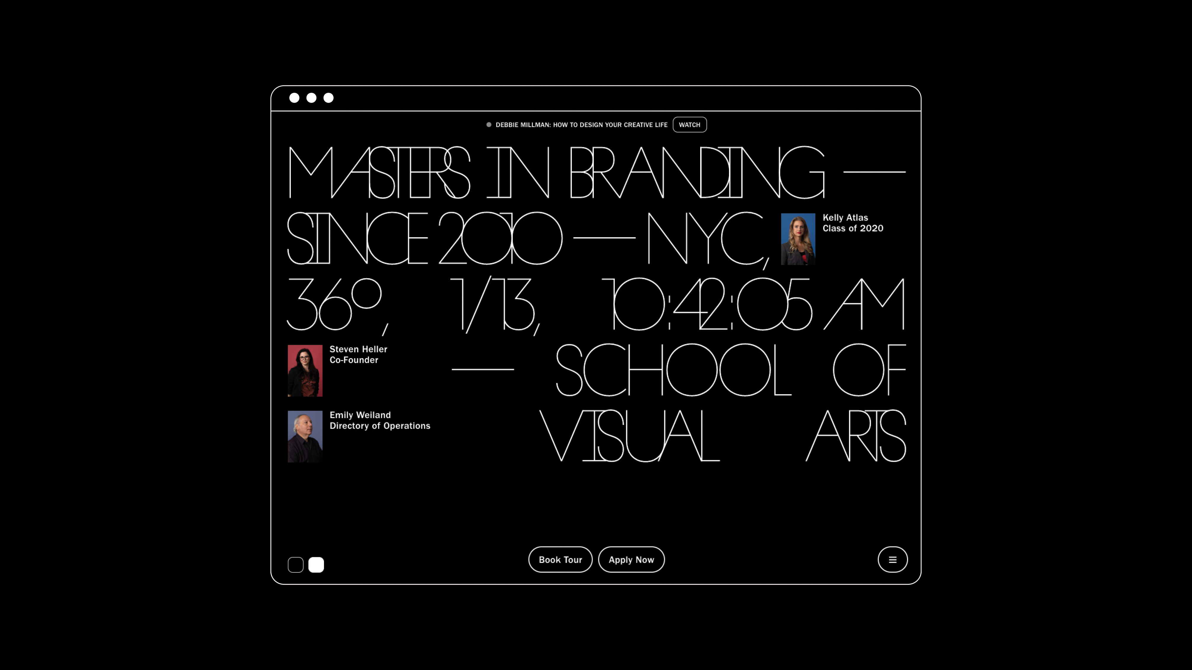
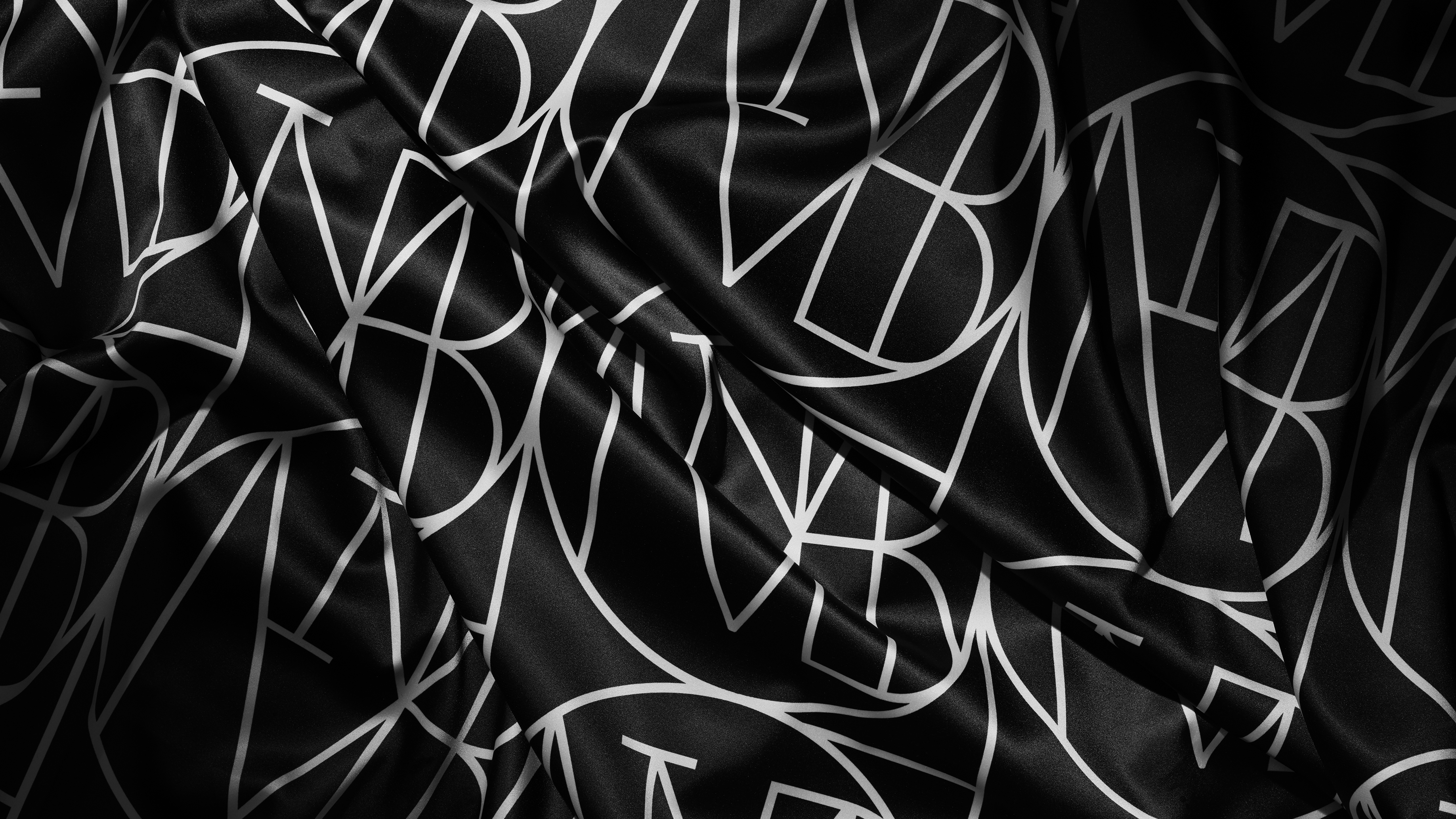
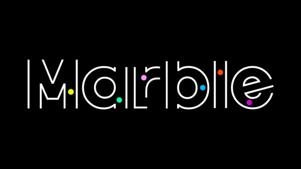
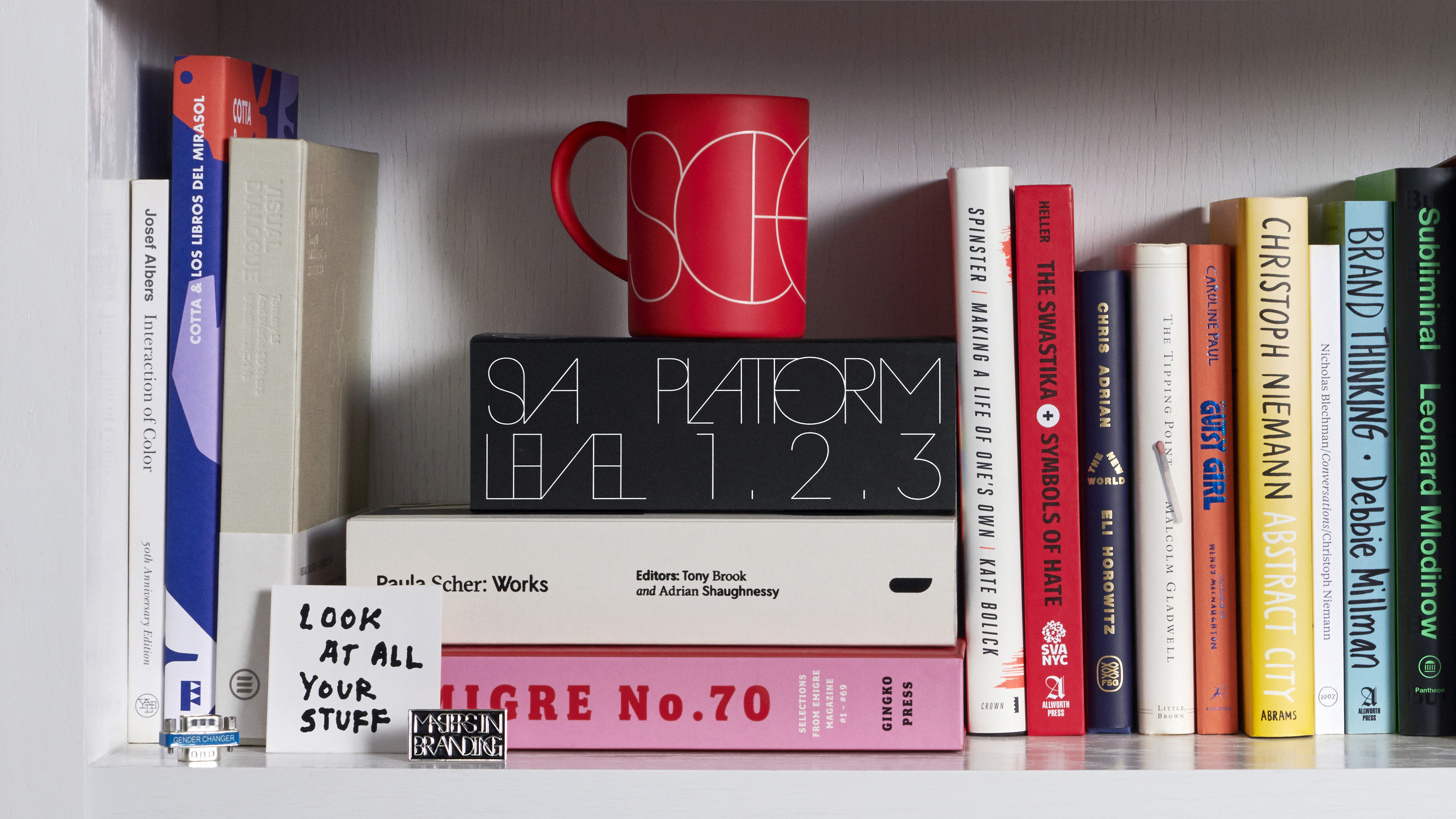
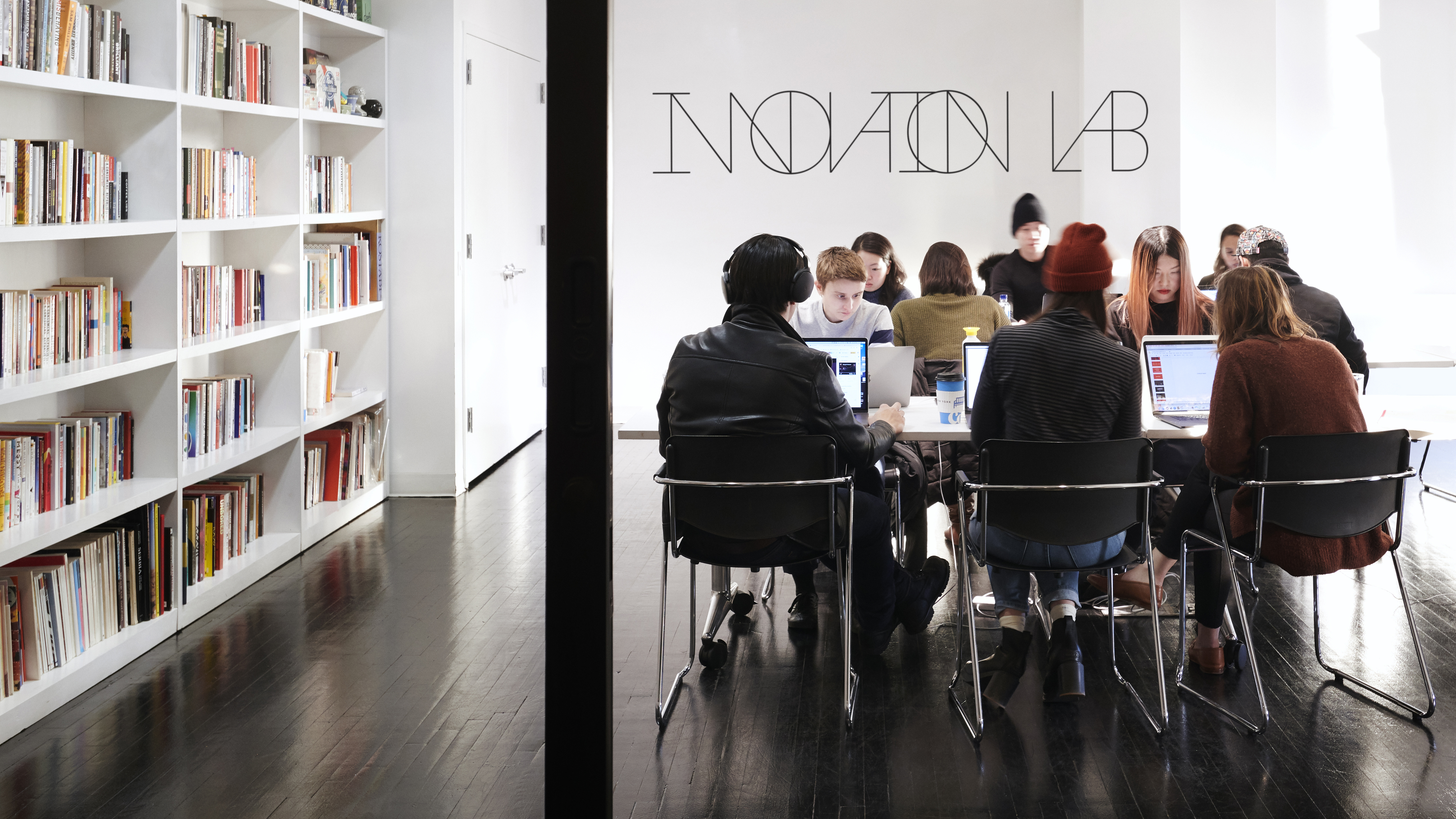
We worked with Commercial Type and typographer Berton Hasebe, to build a continuous typeface made from thousands of unique ligatures, creating an uninterrupted flow of characters that crash together and constantly redefines itself just as our world does.
“From the fundamental strategy to the care and craft of the work, we have an identity worthy of our program.”
Debbie Millman
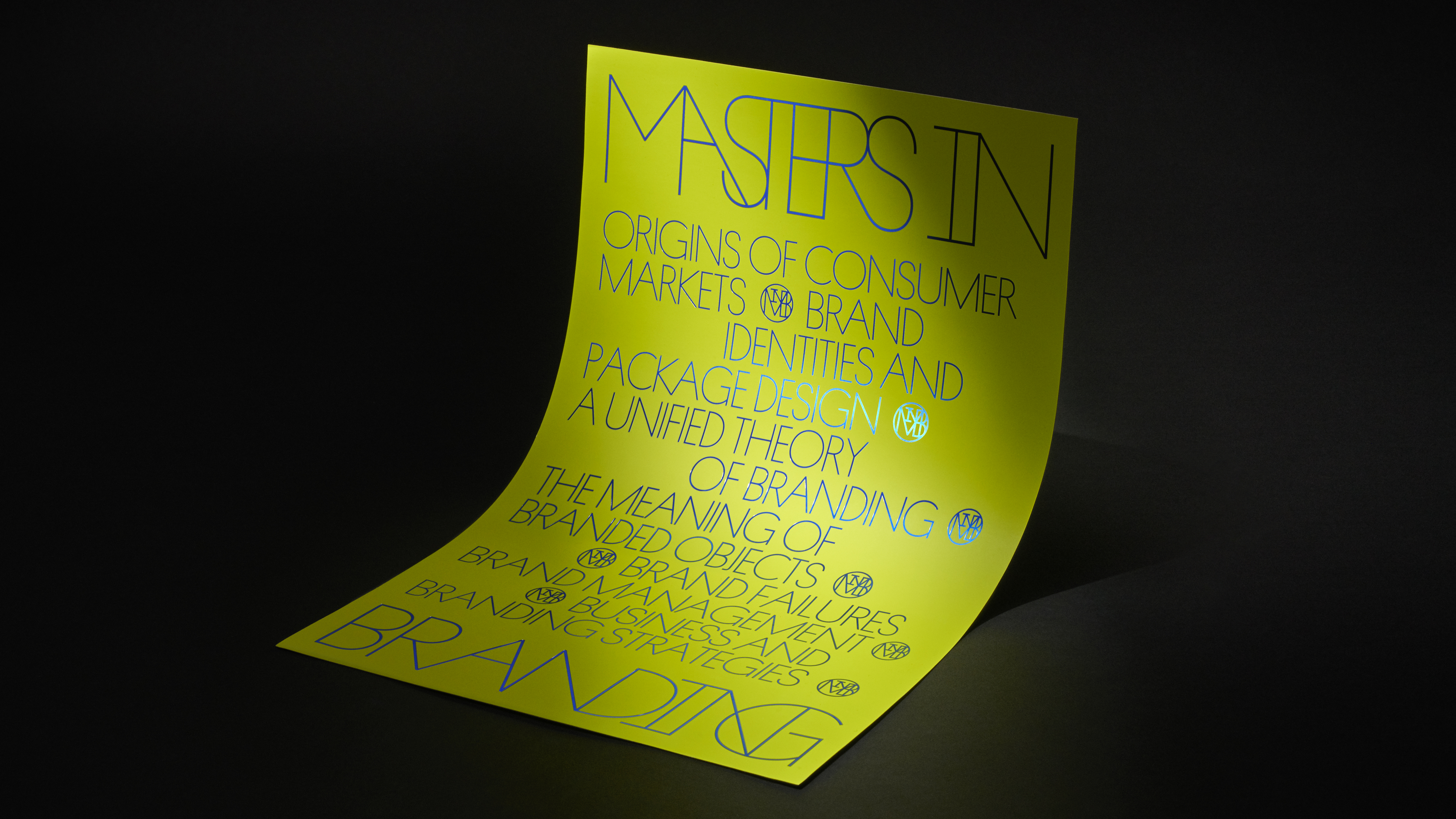
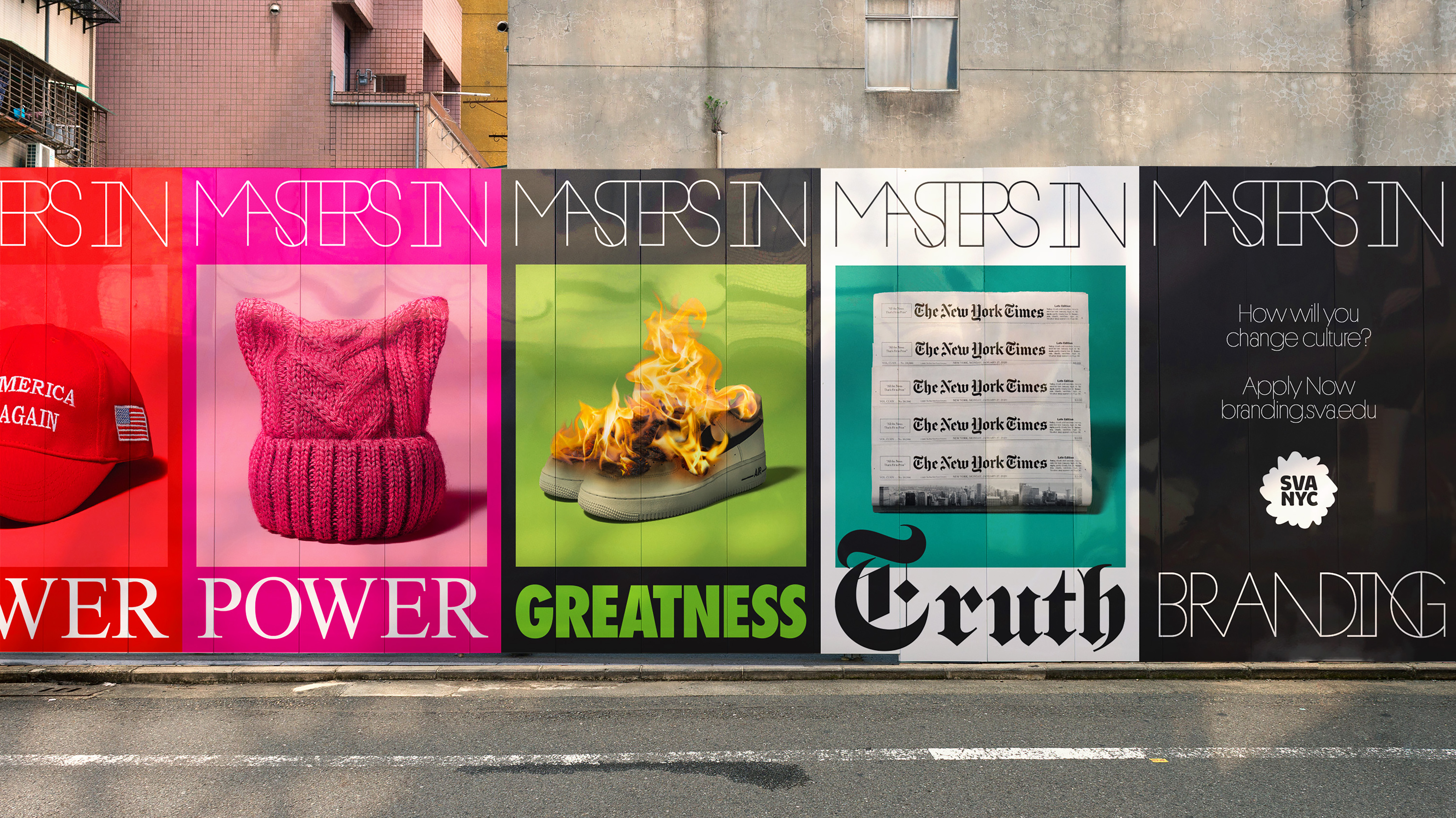
We launched the rebrand in NYC with our Masters In…campaign to highlight past, current and future masters in the field.